GGPLOT2 Tutorial
GGPLOT2 tutorial refers to this short tutorial on using the ggplot2 package of the statistical computing with R tool in order to create simple plots of functions. A wide variety of machine learning algorithms use activation functions and in this context it is very useful to understand certain properties of functions when visualizing them as a simple graph. A simple way of drawing a line graph with R can be found in our article on Plot Function. This short article provides a simple example how the free Statistical Computing with R tool can be used with the package ggplot2 to plot any function while we also provide an example of a tanh(x) function plot. Compared to the simple ways to plot a function in R the package ggplot2 has many advantages such as lattices or easier handling of using different functions in one plot.
> f = function(x){tanh(x)}
> x = -5:5
> y = f(x)
> dataset = data.frame(x,y)
> library(ggplot2)
> ggplot(data=dataset, aes(x=x, y=y, group=1)) +
geom_line() +
geom_point() +
labs(title=”Line plot of tanh(x)”)
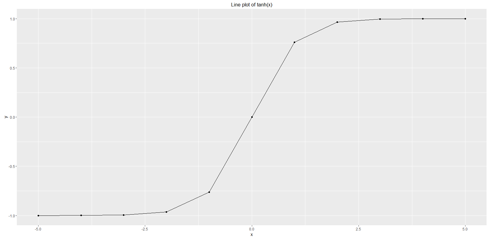
The simple example above creates a line function plot with data points of the tanh(x) function using ggplot2 in R. The first line defines the function f with the tanh(x) while this can be changed to any function definition that should be plotted. The second line defines the data values of x raning from -5 to 5. The third line assigns the variable y with the values of f(x) that in our case is tanh(x) in the x range from -5 to 5. In order to work with the ggplot2 package it is convenient to create an R data frame in line four. We load the library ggplot2 in line 5 and using the ggplot function with our dataset data frame. The function geom_line() indicates that we would like to draw a line plot while geom_point() is optional illustrating the data points of our dataset in context. The plot looks as follows:

GGPLOT2 Tutorial Details
In order to learn more about plotting in R using the ggplot2 package we recommend the following video:


