Plot Function
Plot function refers to the idea of understanding a function better and is very useful to understand certain properties of it especially in the context of various machine learning algorithms that take advantage of big data. One example is the use of the hyperbolic tanh(x) function as activation function with Long Short Term Memory neural networks. This short article provides a simple example how the free Statistical Computing with R tool can be used to plot any function while we also provide an example of a tanh(x) function plot. The function plot is using a line graph whereby the observations or data samples are ordered by the x value and they are connected.
> f = function(x){x * x}
> x = 0:100
> plot(x, f(x), type=’l’, xlab=”x”, ylab=”y”, main=”Line plot of f(x)”)
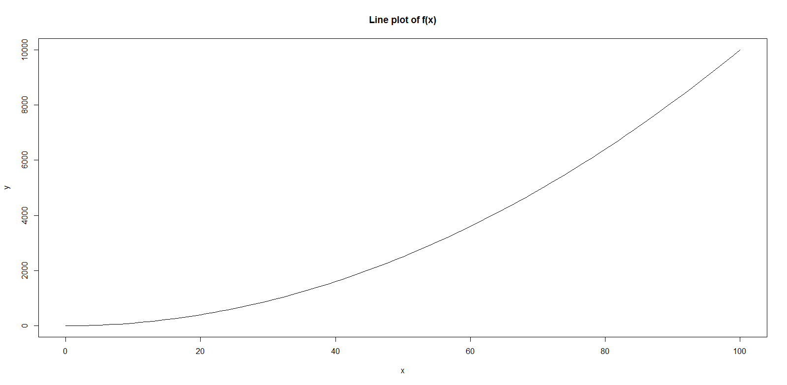
The example above creates a line function plot (type=’l’) of a simple quadratic function f(x) = x^2. The first line creates the quadratic function and assigns it to the variable f. The second line defines the the range of x starting from 0 to 100 in this particular example. The third line creates the actual line plot of our function f(x) shown below. This simple example can be easily modified to create and plot any other function by just changing the definition of variable f to another function.

In order to plot the hyperbolic tanh(x) function we do not need to change much as the following lines reveal. The tanh(x) function is a basic element of R and therefore requires no library to be loaded like the plot function as well. The graph is simple and provides for example not even a lattice for easier interpretation. For a more advanced way of creating a line plot in R including a lattice we refer to our article GGPLOT2 Tutorial.
> f = function(x){tanh(x)}
> x = -5:5
> plot(x, f(x), type=’l’, xlab=”x”, ylab=”y”, main=”Line plot of tanh(x)”)
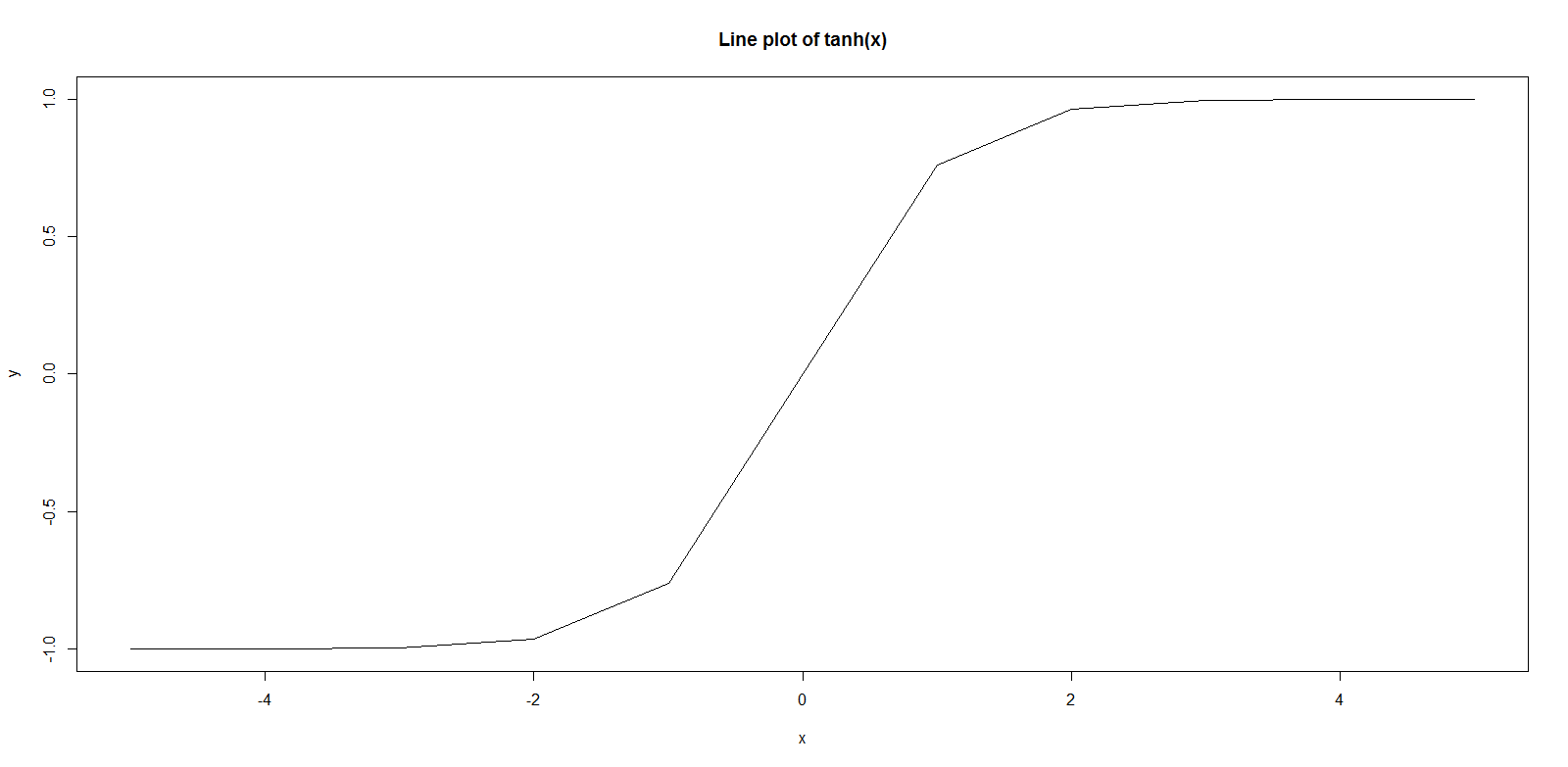
Note that it is important to specify x here in the plot command otherwise the ‘index’ will be used of the data structure that reflects the result of f(x). It is a common mistake to just plot a function without specifying x as well whereby the index and only positive values are shown in the plot. This is not very obvious in positive value examples above, but becomes very clear when using negative values for x like in the tanh(x) example here. We only changed the function to be tanh(x) and this time we specify x to be between -5 and 5. The resulting plot is as follows:

Plot Function Details
In order to learn more about plotting in R we recommend the following video:


